Sunday, March 10, 2013

Cartographic Transformation with MicroCAM and ArcMap


        For this project I will be doing a cartographic transformation from two existing projection. I will achieve the transformation by combining the two projections together to create a new projection, unique of the two original projection. The projections that I have chosen to do the transformation on are the Winkel Tripel Projection and the Hammer Projection.

        The Winkel Tripel Projection was developed by Oswald Winkel in 1921. The word Tripel in Winkel Tripel refers to the combining of three elements of distortions, which in this case are area, direction, and distance. Unlike all other projections that try to either be conformal or equivalent, the Winkel Tripel is unique. The projection itself does not try to eliminate any of these distortions individually, rather it attempts to eliminate all three. Below is a depiction of what the projection would look like.


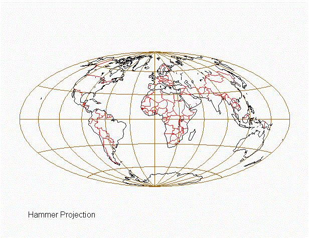
The hammer projection, however, was developed by Ernts Hammer in 1892. It was developed from the same elliptical shape as the Aitoff projection, which was developed by David Aitoff based off of the Mollweide projection. Ernst Hammer created this projection by applying the same 2:1 elliptical equal-area design based on the Aitoff projection. Both of the Aitoff and Hammer projections are compromise projections, neither conformal or equivalent, and look very similar in characteristics. Below is a depiction of what the Hammer projection would look like.


        As a result of combining the Winkel Tripel and Hammer projection, I ended up with another projection which I named Winker (a combination of Winkel and Hammer). This projection was created based on the Goode's Homolosine Projection and as such look somewhat similar to it in design. I started the projection by combining the Winkel and Hammer projections at the equator in MicroCAM. The Winkel Tripel Projection covered the range of 180 ° W to 180 ° E and 40 ° S to 40 ° N along the equator. The Hammer Projection covered the ranges of 180 ° W to 40 ° W, 40 ° N to 60 ° N; 180 ° W to 20 ° W, 60 ° N to 90 ° N; 40 ° W to 180 ° E, 40 ° N to 50 ° N; 160 ° W to 40 ° W, 50 °N to 60° N; 160 ° W to 50 ° W, 60° N to 90° N; 180 ° W to 100 ° W, 40 ° S to 90 ° S; 100 ° W to 20 ° W, 40 ° S to 90 ° S; 20 ° W to 80 ° E, 40 ° S to 90 ° S; and 80 ° E to 180 ° E, 40 ° S to 90 ° S. Below is a depiction of what my projection look like after these parameters were established in MicroCAM.


        I then exported the projection out of MicroCAM and imported the projection into Inkscape for editing. I added in colors to all the grid cells by using the paint bucket option in Inkscape, adding blue for water bodies, brown for land covers, and white for ice caps. After I finished editing, I exported the bitmap out of Inkscape and imported it into ArcMap. I added a title, scalebar, legend, north arrow, and a black background to the map to make it stand out more. Below is the final result of the projection for this project.


Monday, February 25, 2013

Terrain Analysis with Landserf 2.3

        For this project I am choosing to do a Terrain Analysis using a DEM that was obtained from the National Map Viewer website by using the program Landserf 2.3, which was developed by Professor Jo Wood of  giCentre School of Informatics. Again, I am choosing to do the project on a portion of Humphrey's Peak, the same region that I worked with for my previous project on Terrain Visualization, depicted below.


        I begin this project by importing the DEM that I obtained from National Map Viewer into Landserf 2.3. Next I converted the DEM into a useable format. Since the image imported had no reliable Latitude/Longitude measurement, I decided to edit the map projection setting to Latitude/Longitude (WGS 84 ellipsoid). I then reprojected the image using the UTM coordinate system. The next thing that I did was create a Hill Shaded Map by changing the surface parameter and choosing the Shaded Relief option.

        From this Shaded Relief Map, I changed the surface parameter again choosing this as my primary raster and created a Feature Extraction Map showing surface network channels and ridges. I then combined the Hill Shaded Map and the Feature Extraction Map by changing the display to Hue-Intensity, choosing the Feature Extraction Map as my primary raster and the Hill Shaded Map as my secondary raster. The result is depicted below with Humphrey Peak's surface network of channels shown in blue and its ridges shown in yellow. I have included a histogram showing the statistical result to go with the map. As we can see from the histogram, planar surfaces have the highest occurrence.


Drainage Network Analysis Map:


The next step in this project is to create a slope analysis map. I will be using the same DEM of the same region for this portion of the project. The first thing that I do is create a slope map by changing the surface parameter to slope and an aspect map by changing the surface parameter to aspect. I then combined and overlay my slope map on top of my aspect map, choosing the blend option with 50% blending of both maps with the primary raster being the slope map, and the secondary raster being the aspect map. Below is a depiction of the final result showing areas with steeper slopes in bright red and areas with slopes that are not as steep in yellow. In addition, the aspect map underneath helps to show the directionality that the slope is facing for this portion of Humphrey's Peak in dark red and blue. I have also included a histogram below to show the statistical result of this map.

Slope Analysis Map:


The final portion of this project is to create an Curvature Analysis Map. I begin this process by creating a Plan Curvature Map by using the surface parameter option Next, I create a Mean Curvature Map also by using the surface parameter option. I then overlay the two by using the blend option putting my Plan Curvature Map as the primary raster and my Mean Curvature Map as the secondary raster showing the degree of curvature on the landscape. My final result is depicted below with lines showing the rate of change of aspect for Humphrey's Peak. Again, I have included a histogram to show the statistical result of the map depicted.

Curvature Analysis Map:


Sunday, February 10, 2013

Terrain Visualization with MicroDEM

I chose to do this project on a portion of Humphrey's Peak, which is one of the tallest mountains in central Arizona. Humphrey's Peak have a rocky terrain with treeline around 11,400 feet. It is one of the oldest extinct volcanic peak. Since the area that this project was based on have mainly a rocky terrain with no vegetation or water bodies, all of the map that were created would also have a rocky terrain, which is helpful in this application because we are interested in the elevation. The latitude and longitude extension of this terrain is 35.3920015° N (Northern Coordinate),   35.2761246° N (Southern Coordinate), 111.747437W° (Western Coordinate), and 111.592094° W (Eastern Coordinate). The program that was used to create this project was MicroDEM. For this project, I created 5 maps for this region.

The first map that was created was a Hill Shaded Map that was created of the region. I created this map from the ASTER DEM of the United States. The color scheme is gray with a vertical exaggeration of 2; sun azimuth at 65° NE and sun elevation at 43°. Below is a depiction of what the Hill Shaded Map looks like.


The second map that was created was the Elevation Map. By using the display parameters options, I was able to set the display option to terrain color scale with 5 contrasting colors and no stretching. My elevation map looks like the following.


The third map that was created was an overlay of the two previous maps. By showing the grays scale reflectance of my hillshaded map on top of my elevation map, I was able to create a combination showing of both of the above maps. The attribute of the map below would be a combination of the two above it.


The fourth map created for this project was a Contour Map. Again, by using the display parameters option, I was able to create a contour map with contour intervals of 50 meters, specified contour colors with red contour lines, contour line width of 1, and index contour width of 4. Each lines of contour are labeled with Font 12 Arial. I then added the Hill Shaded Map, which already have all of its attribute described above, as an overlay by using the terrain shading option in MicroDEM. The final result is depicted below.


The final map in this project would be the Line of Sight Map, which is basically the sketching of a line of sight, showing what an observer would see if he/she is standing on a particular point looking in a certain direction, on the Hill Shaded Map (again, all of its attributes are already defined above in the description of the Hill Shaded Map). My line of sight starting point is at 35.3556480° N    111.703053°W, and my ending point is at 35.3338359°N    111.626769°W. As shown below, the green line shows the portion of the landscape that an observer would see if he/she maintains a straight line of sight all the way across the landscape from the starting point to the ending point, and the red shows portions that the observer wouldn't be able to see at all. The plot of the Line of Sight Map depicts this very well.


Sunday, January 27, 2013

Map Generalization with Map Window GIS


Line generalization is important in cartography in that it reduce the volume of data while at the same time preserves positional information. For this project, I generalized a small portion of the U.S. map, the country Madagascar and measured its line lengths in order to see how much volume data was reduced.I found that approximately 25% of the volume data was reduced at 100% generalization as we can see from the table below.

I found that as the x-axis (% generalized) gets bigger, the y-axis (line length) gets smaller. The reason that line length does not increase in proportion to detail is because the two variables have an inverse relationship, meaning as one goes up the other one will go down. Therefore, the more a map get generalized, the more details it will lose, so the lengths of lines will decrease.

The measurements that I got over 4 line segments was enough to tell me that a map that is 100% generalized would have shorter line lengths than the original map. The methods that I used to achieve the measurements for this project go as follow:

1.) Generalized a world map found on mapshaper.org by using the Douglas-Peucker method.
2.) Measured the line length of a small portion of the map, Madagascar, of the original map as well as the line length of the generalized map on MapWindow GIS, before exporting the maps out for editing.

The table above shows the result that was gotten from the measurement of the line lengths of the two graphics. As we can see from the table above, the total line length of the generalized map is smaller than that of the original map.

Below is a depiction of the graphics that I was working with in MapWindow GIS, with the green line showing the original lines as it would look like on a world map, and the blue line showing that area of the map as being generalized at 100% with 0% of the original graphic retained.


After I finished measuring the graphics, I then exported them from MapWindow GIS along with the north arrow, scalebar, and legend, and imported all of these elements into Inkscape. I then combined the north arrow, scalebar, legend, and graphics into one map. However, I did not like the layout of the map so I then imported them into paint and used the select feature in paint to move them around until I felt satisfied with the layout of the map.

I then imported this file into ArcMap and added an inset overview map, a title, and neatline. Finally, I imported the map into GIMP and added background colors to the map to make it look nice. Below is the final turnout of my project.

Monday, January 14, 2013

Creating Projection with MicroCAM


For this project, the first thing that I did was looked at all of the commands for the Goode's Homolosine Projection and try to figure out what each one did. I then created a unique projection of my own by combining the Miller and and Mollweide projections along the equator. The steps below are the actions that I took in fusing the two projections.

- Analyzed the commands and tested them to see how I can apply them to making my own projection
- Picked 2 projections to merge, I ended up using the miller and the mollweide and joined the two at the equator; with the top half going from 0 to 80N and the bottom half going from 0 to 90S
- Typed out the initial Rem commands and title
- Typed out the commands for mapping the grid of the miller including the geoffset, map scale, and map bounds at 0 to 80N, and 180W to 180E
- Typed out the command to map features such as coastlines, islands, and lakes
- Moved to mapping out the bottom half of the map
- Set geoffset, mapbound, and mapscale for the bottom half portion of the map by using the mollweide projection
- Mapped out the top half of the mollweide at the equator ranging from 0 to 40S, and 100W to 20W
- Map out the bottom half of the mollweide ranging from 40S to 90S, and 100W to 20W
- Move over to map the next portion of the map at the equator
- Mapped out the top half of the mollweide at the equator ranging from 0 to 40S, and 20W to 80E
- Mapped out the bottom half of the mollweide at the equator ranging from 40S to 90S, and 20W to 80E
- Move over to map the next portion of the map at the equator
- Mapped out the top half of the mollweide at the equator ranging from 0 to 40S, and 80W to 180E
- Mapped out the bottom half of the mollweide at the equator ranging from 40S to 90S, and 80W to 180E

- After the projection was completed I imported it into Inkscape for edit. I, added colors to the continents and water bodies while leaving the ice caps white.

- I then imported the projection into ArcMap and added a title, neatline, scalebar, and north arrow. Below is a depiction of the final result.